Fixily - One size fits all SVG application
It seems if you want to make some money now days on the web, you need to build yourself a Mobile Application. Everybody's doing it! So me and my work colleague Paul decided we were going to jump on the band wagon.
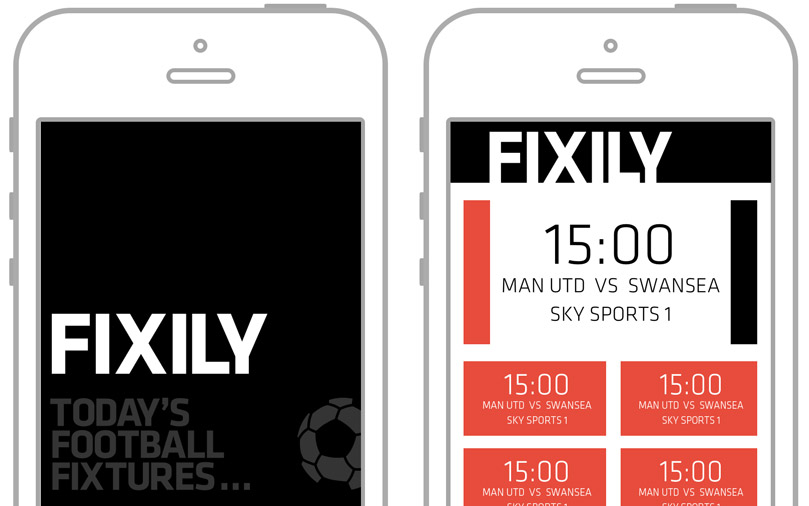
Now supposedly the rules are simple for creating a multi million pound app, simple and straight to the point. So we came up with Fixily, a simple little application that would display you the closest days worth of football fixtures. Who was playing, what time and what television channel was broadcasting it.
Paul knocked up the design in a hour and a half and then it was time for me. I didn't know Java nor C# and I didn't have time to learn it (I'm a really busy man!) and the only Java Paul knows is the granulated sort.
So we went down the route of this whole "Web View" wrapping approach in which you can create an application in HTML, javascript and HTML 5 which we both knew very well. The leader in this was PhoneGap using Apache Cordova. I tested this out 4 years back when I created an app for putting templated male genitalia on someones forehead and sharing it on social media... I didn't realease that one.
But I didn't want to just use HTML and Css for the structure, I wanted to try out Adobes new SnapSVG as I was a big fan of Dmitry Baranovskiy's Raphaël framework who wrote this one.
The greatest feature about SnapSVG is that you can load in SVG files and manipulate the elements. So theoretically you can design a mobile application in Illustrator, export it as SVG and load it straight in. So thats what I did.
Snap.load( "/assets/js/svgs/fixily.svg", function ( ai ) {

	$.get( '/get/16-08-2014', function( $result ) {

		data = $result;

		var header = ai.select( '#header' );
		var footer = ai.select( '#footer' );
		var featured = ai.select( '#featured' );
		var subs = {
			sub1 : ai.select( '#sub_1' ),
			sub2 : ai.select( '#sub_2' ),
			sub3 : ai.select( '#sub_3' ),
			sub4 : ai.select( '#sub_4' ),
			sub5 : ai.select( '#sub_5' ),
			sub6 : ai.select( '#sub_6' )
		};

		featured.node.addClass( 'animated slideInDown');

		var featuredTime = featured.select( '#featured_time' );
		var featuredFixture = featured.select( '#featured_fixture' );
		var featuredChannel = featured.select( '#featured_channel' );

		featuredTime.node.textContent = data[0].time;
		featuredFixture.node.textContent = data[0].home + ' vs ' + data[0].away;
		featuredChannel.node.textContent = 'SKY SPORTS 1';

		for( var i in data ) {
			if( i != 0 ) {
				var subData = data[i];
				var sub = subs['sub' + i];
				if( typeof sub !== 'undefined' ) {
					sub.node.addClass( 'animated slideInDown');
					var subTime = sub.select( '.time' );
					var subFixture = sub.select( '.fixture' );
					var subChannel = sub.select( '.channel' );
					subTime.node.textContent = subData.time;
					subFixture.node.textContent = subData.home + ' vs ' + subData.away;
					subChannel.node.textContent = 'SKY SPORTS 1';
					board.append( sub );
				}
			}
		}

		board.append( header );
		board.append( footer );
		board.append( featured );

	});

});
This is not the whole code but it's not far off. These 40-50 lines do the following:
- Load in the main Fixily SVG screen from an exported Illustrator File
- Fetch the match data via AJAX
- Define a variable for all the main parts of the screen
- Set the featured match data
- Set the normal match data
Very simple and loads straight in. Right, now I have a slight problem as we designed this application for an iPhone 5 which has a screen size of 640x1136 and we only wanted one source code and wanted the design to stick as best as it could across all screen sizes.
Thats the main reason I wanted to use SVG (scalable vector graphic). This piece of code is a gem:
var designedWidth = 640;
var designedHeight = 1136;
var board = Snap( "#svg" );
var stadium = window.document.getElementById( 'stadium' );

stadium.style.height = window.innerHeight + 'px';
stadium.style.width = Math.round( ( designedWidth / designedHeight ) * window.innerHeight ) + 'px';

board.attr({
	viewBox: [0, 0, designedWidth, designedHeight],
	height : window.innerHeight,
	width : Math.round( ( designedWidth / designedHeight ) * window.innerHeight )
});
By scaling the application wrapper element (stadium) height and width up or down at the correct ration and setting the view box on the SVG root we can achieve just that! Now all you need to do is centrally align the wrapping element and put a black background on the body element. Some screens/devices may have a small gap either side but the black background masks this. Everything looks fine and dandy...
Well not really...
You may have noticed that on the example, depending on what size the browser is, there are white lines where the elements don't sit flush. I'm not sure at the moment whether this is caused by the SVG elements not being pixel perfect (its exported from Illustrator so my moneys on that) or the a rounding issue in the above code.
End Of Part 1